I recently finished a specialization on Coursera called IBM Data Science Professional Certificate. The final class was the Applied Data Science Capstone in which I had to complete project using the Foursquare API, geospatial data, and many modules that I had worked with in previous labs.
I chose to cluster certain neighborhoods in Seattle, using the Foursquare API data, and throw in some census data (2010) to give further context to each area. All the code from the project was repurposed from one of the labs that was offered in the class, and the credit for the code goes to the creator of the course, Alex Aklson, Ph.D IBM Data Scientist.
The full notebook can be viewed on Github.
There were not many conclusions to draw from the report, and actually, the ‘Physical Therapy Clinic’ in the title could be substituted for many different types of businesses. I listed six potential categories of data that would be necessary for a valuable report, and I only had two of them.
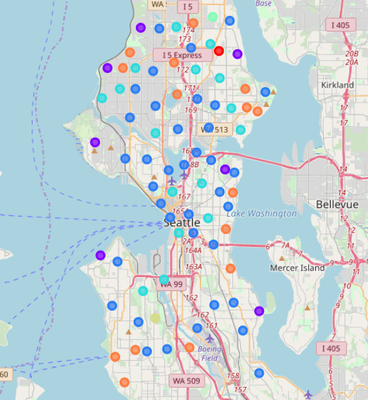
Despite the lack of surrounding data, I will highlight the coolest thing about the analysis. The neighborhoods were segmented on how frequently certain venues (stores, parks, offices, restaurants) appeared within a chosen radius from the venue.
I arbitrarily chose seven as the amount of clusters to form. Using the folium module, and some of the lab code, I was able to create the graphic below.

My favorite cluster was the orange cluster (Cluster #7). In the Juptyer Notebook, I was able to click on the circles and they would display the name of the neighborhood, but that will not be the case in the gist or the image above. The table data for Cluster 7 is as follows.

Very interesting what can be done with a few libraries and good data.
I hope this was fascinating or in some way informative, and thanks for reading!


